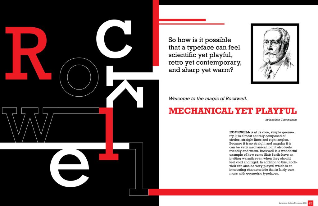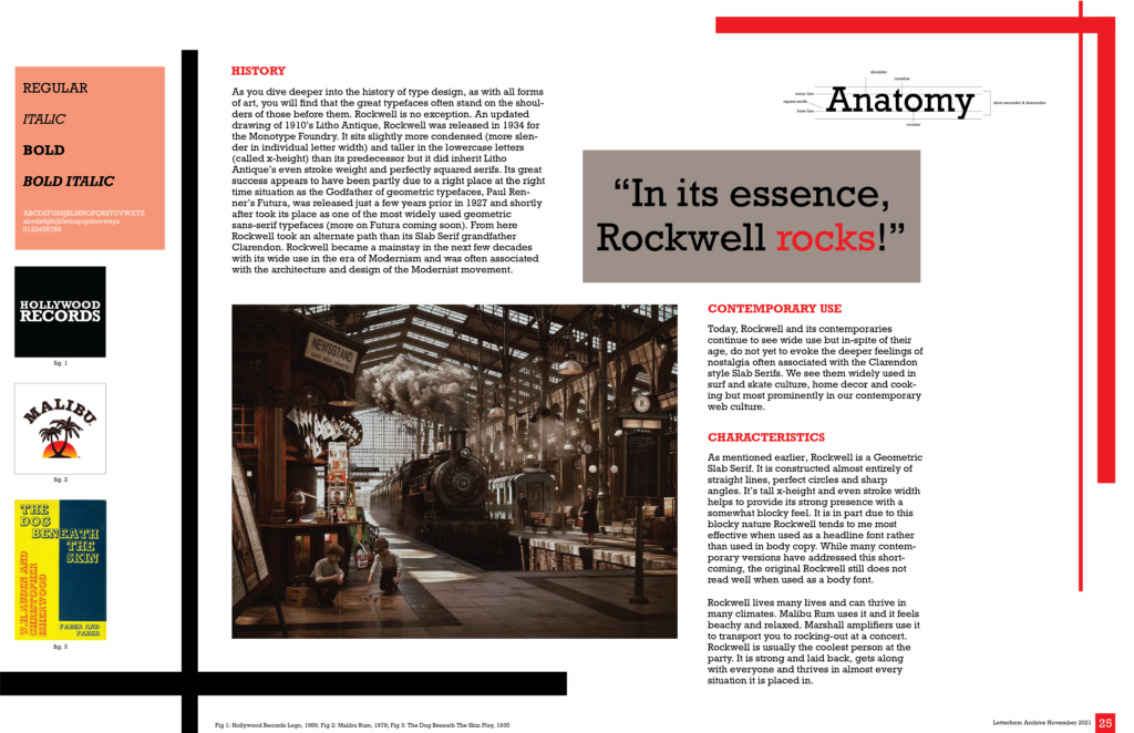

This two page magazine spread captures the characteristics of a major typeface. I decided to do a study on Rockwell, highlighting it’s many facets and juxtaposing qualities. Rockwell is sharp yet inviting; retro yet contemporary; mechanical while also being playful. These spread ideas reflect those attributes through its line-work, color palette, and carefully crafted negative space, bringing out the core essence of the font. Rockwell rocks!