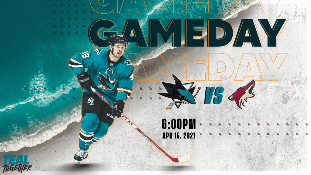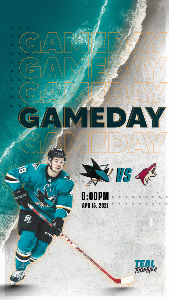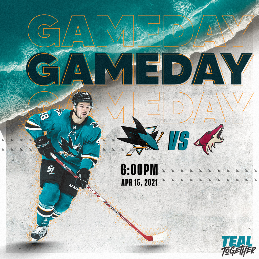
Pictured are some variations of a visually compelling “Gameday” Graphic for the San Jose Sharks’ social media. This graphic employs a vintage, eclectic look reminiscent of 90s design styles to reflect the general aesthetic of the team at the time. My main idea during the design process was to focus on texture and asymmetry while maintaining compositional balance. The grittiness of the background textures reflects the nature of hockey as a sport in itself, and the strict use of grid lines acts as a juxtaposition to that same concept.

The drop text outlines and bold title draw the viewer’s eye towards the main purpose of the graphic as well as the featured player on the graphic. The shark fins are used to enhance the text through texture yet again without being overbearing. To display the information, the logos of both teams in the matchup were utilized to avoid an overload of text on the graphic. All design elements pictured adhere to the San Jose Sharks’ official design handbook.


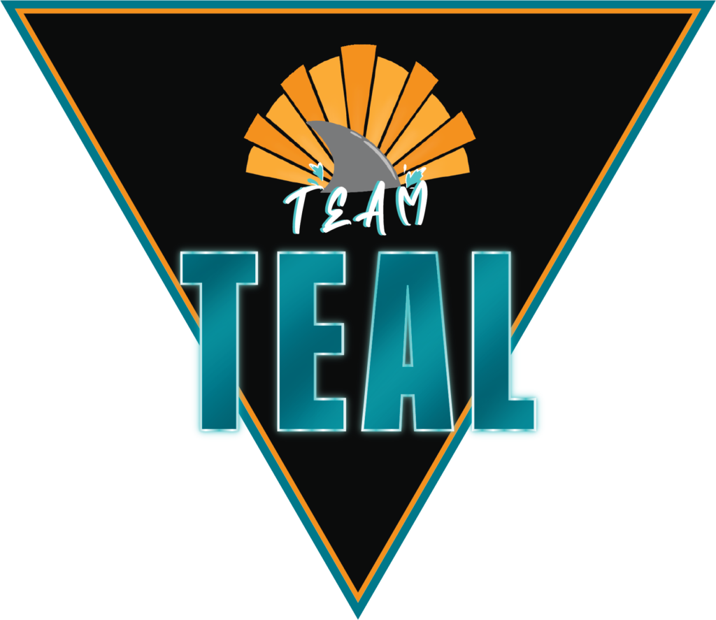
The above logo was designed for Team Teal, a collective group that encompasses all organizations associated with the San Jose Sharks, including the SAP Center, the San Jose Barracuda, all Sharks ice facilities, and the non-profit Sharks Foundation. I wanted this design to appear bold and fitting of a professional sports organization while also showcasing a large part of the Sharks’ identity: togetherness. The use of a script font and a cartoonish vector illustration add a personal touch to the logo while softening the sharper edges of the other design elements. On the other hand, the neon and metallic nature of the “teal” ensures that the logo stands out at first glance while adhering to the design values of the Sharks as a whole.